Seattle Wayfinding
Concept Project
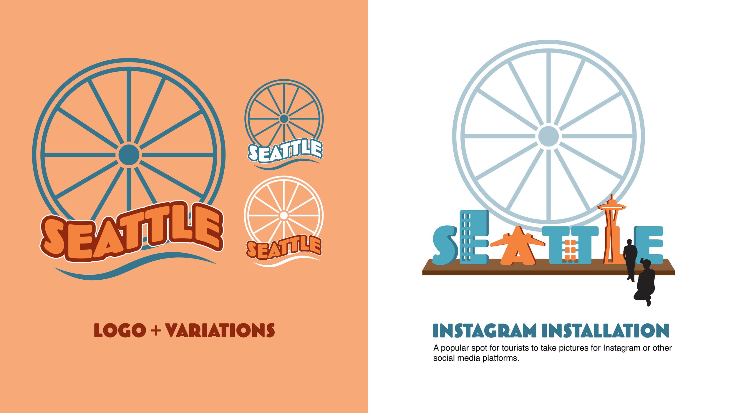
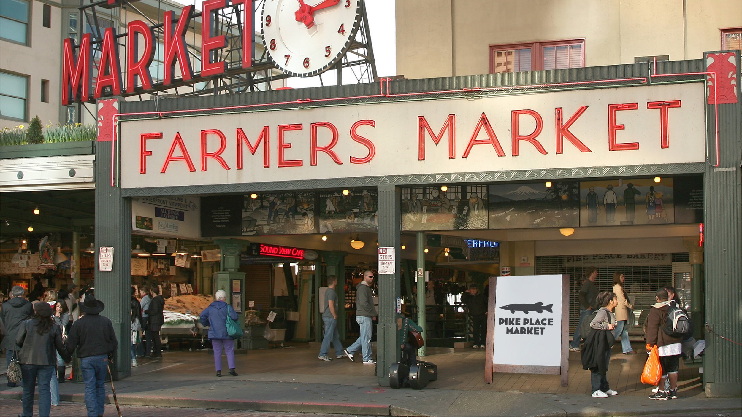
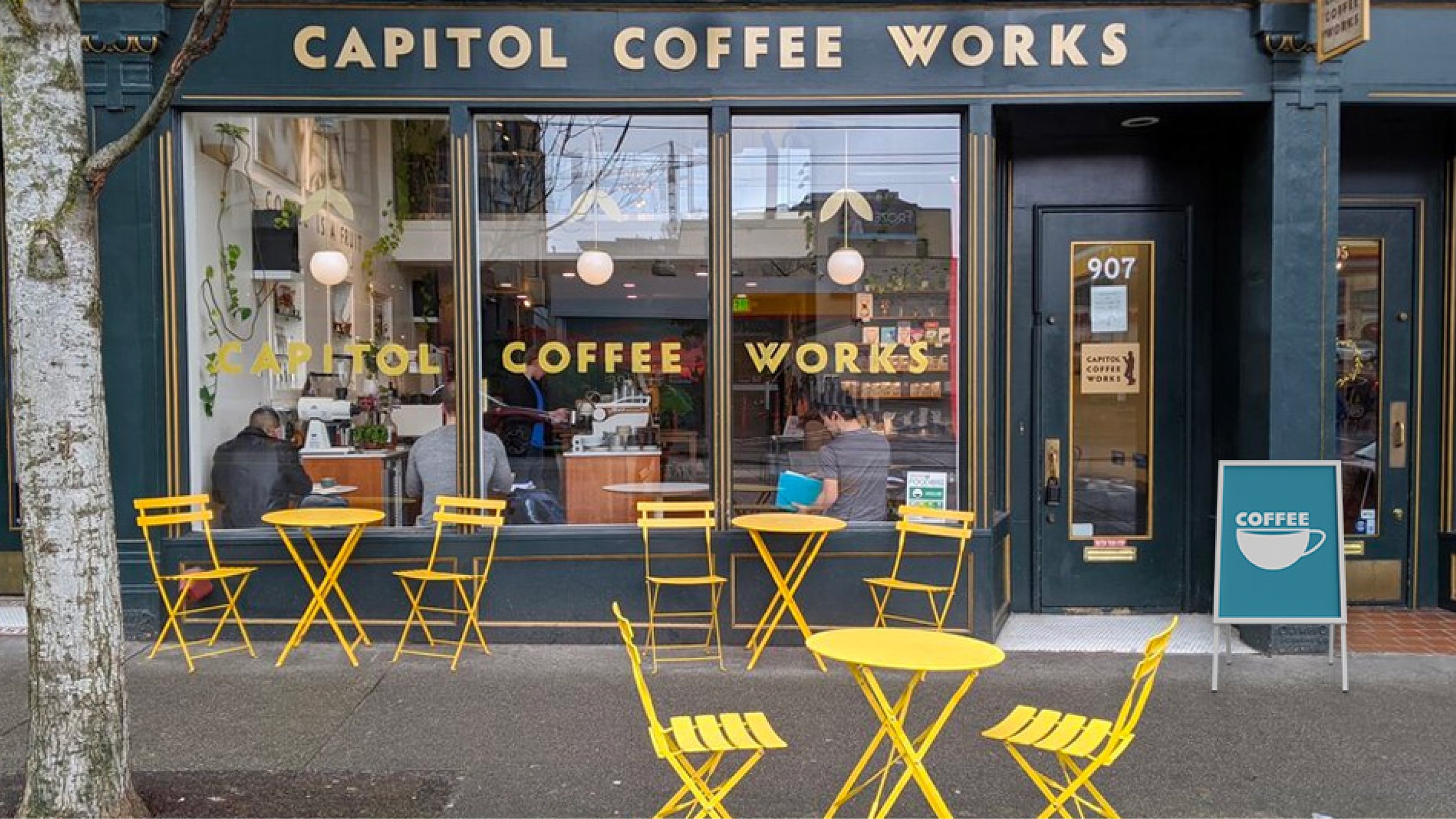
For this project, students had to rebrand a city and its signage. Specifically, the city chosen must have the potential to attract new visitors and thrive economically. Being Seattle is known for having a boom-and-bust economy, I thought Seattle would be the perfect city to rebrand for this project. Over the years, Seattle has brought people in with its amazing railroad systems, caused people to leave during its periods of economic depression, then caused people to come back during the time period of the California Gold Rush, and so on. Thus, I wanted to make Seattle a city that people wouldn’t question leaving again—I wanted citizens to feel proud of their city and visitors to be interested in traveling there. I went with a color palette that seemed fitting for Seattle’s rainy atmosphere, and I allowed the Seattle Great Wheel to inspire my new logo for the city. From there, I created an Instagram installation for visitors to take pictures for social media, and I worked on the rest of the signage for the city, including mock-ups of how they might look in real life. I also find the bathroom signs to be very unique, as they resemble the cabins you would see on the Seattle Great Wheel.
Softwares used: Adobe Illustrator and Photoshop
Art Direction / Logo Design / Way Finding / Typography / Digital


